By Daniel Maidman, artist and novelist and Peri Schwartz
This post originally appeared as an article of the same title in the August/September 2016 issue of International Artist
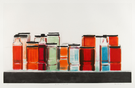
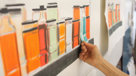
Artist Peri Schwartz has worked for several years on distinctive still-lives of colored liquids in glass containers. She recently collaborated with master printmaker Greg Burnet to create one such composition as an etching, Bottles and Jars III, which has since been acquired by the Metropolitan Museum of Art, in New York.
In this article, we will discuss two topics:
1. the process through which she produced the etching
2. the etching itself as an art object
As we develop as artists, it is important to remember that, while we work hard to acquire techniques, our goal is not to know techniques. It is to make interesting art.
Several unusual terms appear in the article. The first time each one appears, it is underlined. This indicates that it appears in the glossary of terms at the end of the article.
TECHNIQUE
Printmaking as an art process ranges from the basic to the extraordinarily advanced. Schwartz’s and Burnet’s etching technique is a very sophisticated kind of printmaking. The step-by-step presented here is not a method the beginner can expect to follow without years of training and practice – but it does point the way toward the potential of this versatile, demanding technology.
Bottles and Jars III is a color spit bite aquatint with drypoint and sugar lift done on four copper plates.
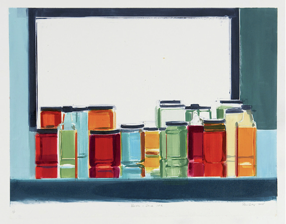
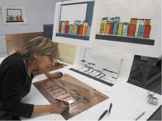
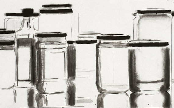
1. Schwartz showed Burnet a monotype of a proposed composition. The monotype was used as a reference for color and composition for the etching. Schwartz traced the composition from the monotype onto a copper plate and then drew over the traced lines with a drypoint needle. Burnet took the first proof. This proof served both as the black and key plate.
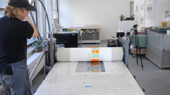
2. Burnet prepared the plate for a process in which he specializes: spit bite etching. Spit bite etching involves use of a brush to apply dilute acid to a prepared plate. The technique has many of the characteristics of watercolor. The liquid on the copper pools in beautiful and unexpected ways. Burnet comments, “The acid I use is ferric chloride; it bites with a much better, cleaner line than nitric acid. It turns black as it bites, so with spit biting you can see where you’re going against the copper color.” Burnet watched Schwartz very carefully with a stopwatch as she applied the acid. He timed how long the acid sat on the plate and wiped it off when he thought the acid had “bitten” enough. “He isn’t only watching the clock,” Schwartz says, “He is reacting to how my brushstrokes look. It’s as if I have a coach encouraging me to keep going- ‘You’re doing great, that’s a gorgeous puddle of acid,’ or, ‘You need to redo that’.” Burnet then cleaned the plate and took another proof. This yielded a strong black plate with beautiful tones and the composition in place.
3. Work began on the second plate with tracing the composition onto the plate. Now Schwartz was only working on applying the yellow/orange parts of the image. Again, Burnet coached her on where to apply acid. At the end of the process, they were ready for another proof, combining the existing black with a new yellow pass. This same procedure was done for a red and a green/blue plate.
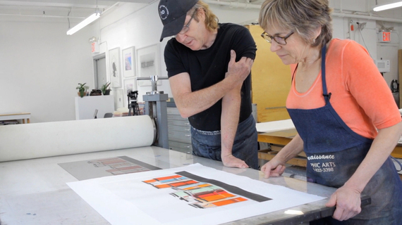
4. Revision: At this point, with all the tones in place, the image was still close to the composition in the monotype. Now something about that original composition felt wrong to Schwartz. She and Greg started covering up different parts of the proofs to find new compositions and ended up eliminating the window frame from the original monotype. Burnet encouraged her to work directly on the proofs with colored pencils, making decisions on which areas needed re-etching.
5. As they got closer to finishing, Burnet asked Schwartz to go back in with a drypoint needle to define some of the shapes. He urged her to be bold, so that the final image would have strong lines to break up the tonal areas.
6. Schwartz describes completing the etching: “The image was so close to being finished and yet we both felt something wasn’t right. Here is a great example of Greg’s collaboration in the process. The greens were too strong in the image and were fighting the oranges and reds. We tried lightening the greens and made them more transparent. At first I liked it and then felt it looked too washed out. So Greg came up with a perfect blue – then the etching was finished.”
ART CRITICISM
Daniel Maidman here. I’d like to talk with you as an art critic for a minute – it’s important to consider work from this perspective throughout the learning process. I’ll explain why I like Bottles and Jars III so much.
In formal terms, the clean, minimal space it occupies gives it a modernist energy, while the distribution of related but distinct warm and cool colors from left to right provides it with a wonderful sense of rhythm. This rhythm of color is echoed by a rhythm of line – thick horizontals and thin verticals repeat at irregular intervals throughout.
I also see this body of work as a response to Giorgio Morandi’s still lives. Schwartz follows the same rules Morandi does: she creates a body of work through subtle rearrangements of a limited set of containers. Morandi’s largely opaque, matte-surfaced bottles and cups and pitchers convey a sense of solidity and mass. Light falls on them, but it cannot pass through. There is a sense of exclusion to Morandi’s work. His rules are a willful shutting out of a chaotic world, an attempt to impose order and control by reducing the elements under consideration to a very reliable few.
Schwartz’s clear liquids and containers, by contrast, transmit light. They activate white light by shattering it into brilliant color. There is a vibrating excitement to them, as if they were about to take flight. Morandi’s work retreats from the world, while Schwartz’s reaches toward it. Her clear jars and bottles imply daylight and scenery; we can almost but not quite see everything, just by looking at this tiny slice of it.
Neither Morandi nor Schwartz is right or wrong – their opposed perspectives are both simply material for the art to build upon. The genius of an artist animates his or her basic outlook, allowing us to step into it for a moment through the window of the art.
GLOSSARY
Aquatint
A cleaned copper plate is put in an “aquatint box”: a large closed wooden box with a motorized fan. The fan distributes tiny specks of rosin evenly over the plate’s surface, like a coating of dust. After the rosin dust has settled, the plate is carefully heated, melting the rosin so it can adhere to the copper just to the point that it creates little mounds. Once the plate has cooled the artist paints all the areas he wants white with a varnish. This protects those areas from being “bit” when the plate is immersed in an acid bath. The acid bites channels around the rosin droplets. This procedure is repeated several times to get a variety of tones. Only the channels will hold ink or transfer it to a print – the rosin mounds and the varnish will not. What is distinctive about an aquatint is that the artist no longer has to build up tones with lines – now he can use flat shapes for tone.
Rosin
A hard resin from pine trees that is ground into particles and used in the aquatint process as an acid resistant ground.
Spit bite etching
Rosin is applied to the plate in the same process used in an aquatint. The artist then brushes dilute acid directly onto the plate, very much like a watercolor or wash drawing. Instead of immersing the plate in an acid bath, the biting happens when the artist brushes the acid directly onto the plate. This is repeated several times to get a dark tone. The way the acid pools when it is applied to the plate is unique to this method. Unlike a traditional aquatint, the tone has variation.
Sugar lift
A complex technique involving the use of a sugar syrup, asphaltum (a sticky, heavy form of petroleum), and rosin, to enhance the darkest darks of a final etching.
Monotype
The monotype is often called “the painterly print”. Schwartz uses Plexiglas and paints directly onto the surface. Dampened paper is put over the image and then run through an etching press. This transfers the ink from the plate to the paper, creating the print. Because the Plexiglas is transparent, Schwartz can trace the image on the back, add more ink to the front and run the plate through the press repeatedly until the image she visualizes is complete.
Drypoint
A technique of engraving in which a sharp diamond-pointed tool is used on a plate to produce furrows that have a burr (a raised edge). The ink gets caught in the burr and a soft and velvety line is created.
Key plate
For a composition requiring multiple plates, it is necessary to have a reference plate to work back to in all subsequent plates. This is the key plate. It sets the composition in place for each successive plate, so that they overlap cleanly and produce a clear image.
—-
About Peri Schwartz
Peri Schwartz has exhibited her still lives, studio interiors and self-portraits nationally for over thirty years. Her work can be found in permanent collections throughout the United States and Europe, including the Metropolitan Museum of Art, the Museum of Fine Arts, Boston, the Library of Congress, the British Museum, the Albertina and the Staatliche Museum of Berlin. She began her studies at Boston University’s School of Fine Arts, and continued on to Queens College to receive her Masters of Fine Arts. She currently lives in New Rochelle, New York.
